Available from Tretorn.com OR Amazon!
multiple personalities = multiple craft projects. What the hell is she gonna make today?
Friday, April 30, 2010
Fashion Friday
Available from Tretorn.com OR Amazon!
Thursday, April 29, 2010
Wednesday, April 28, 2010
Collage inspiration
Tuesday, April 27, 2010
Office supplies to art
Wednesday, April 21, 2010
Hot Pad mash up
The project requires 1/4 yard each of both batting and Insul-Brite which will provide enough material for two hot pads. I cut out two pads but didn't get around to making the second one until last week.
Instead of being under a deadline and following the directions this time, I employed the tips learned from Shelli's instructions and just made up other stuff as I went along. It is easy to forget how fun just playing around can be. I seem to learn more by wondering if things will turn out the way I imagine. Besides, who cares if ya mess up a hot pad?
Paisley and glen plaid prints are upholstery fabric scraps from Chrysanthemum's fall skirt festival. The heavier weight fabrics make sense for protecting your hands when you remove that searing hot cast iron skillet of corn bread from the oven.
Instead of quilting the fabric in the prescribed grids, the paisley pattern provided a road map for an "interpretive" outline.
Here's the reverse side.
Decided bias tape wasn't necessary based on the fact that I didn't have the correct color on hand so made my own. Well, not really. Bias is needed when manipulating around curves. The hot pad is straight so my already small fabric strip was NOT cut at 45 degree bias. It's just a narrow strip of brown gingham fabric ironed in half.
For the leading raw edge, it was folded in at an angle.
Checked length of fabric strip to insure it would cover the four sides with mitered corners.
Note: Began stitching about an inch down from beginning of strip so the end of strip could be concealed underneath. That was good thinking on my part, right? But then I messed up by sewing too close to the edge OR making the strip too wide because the border will be wider on one side and narrow on the other. Did I notice? Nope. Did I stop sewing when I realized it? Nah. It's a hot pad mash up. It's how I roll.
Sewed all the way to the corner, backtacked, snipped threads, lifted needle and presser foot. Folded fabric strip away from edge to form miter. (Not sure if this is the correct or best technique but it's the one I tried.) Keep on mashin'.
Mitered fold is underneath the fold.
Turned the pad counterclockwise. Lined up edges and started sewing again. Repeated for each corner. For those of you keeping score at home, we will encounter 4 corners on a square hot pad.
Approaching the origination point. Fabric strip is folded at an angle to reduce bulk.
This is when I realized the gingham border strip could be evened by sewing around the perimeter again with a wider allowance.
Folded it all the way over and ironed it down.
See how narrow it is on the glen plaid side?
As opposed to how wide the gingham border is on the reverse paisley side? It's a blend of kinda groovy and kinda stoopid. Like me.
Topstitched the gingham strip using the left side of the presser foot as a guide.
See that open edge on the mitered corner? Does it bother me enough to hand stitch it closed? Nope.
What I LIKE about this attempt:
- mixing fabrics
- using paisley print as a guide to freeform quilting
- the texture of the quilting
- using fabric scraps
- just sitting at the sewing machine and "playing" with no deadlines or expectations
What I didn't like:
- Nope. Refraining from saying stuff I don't like this week.
Tuesday, April 20, 2010
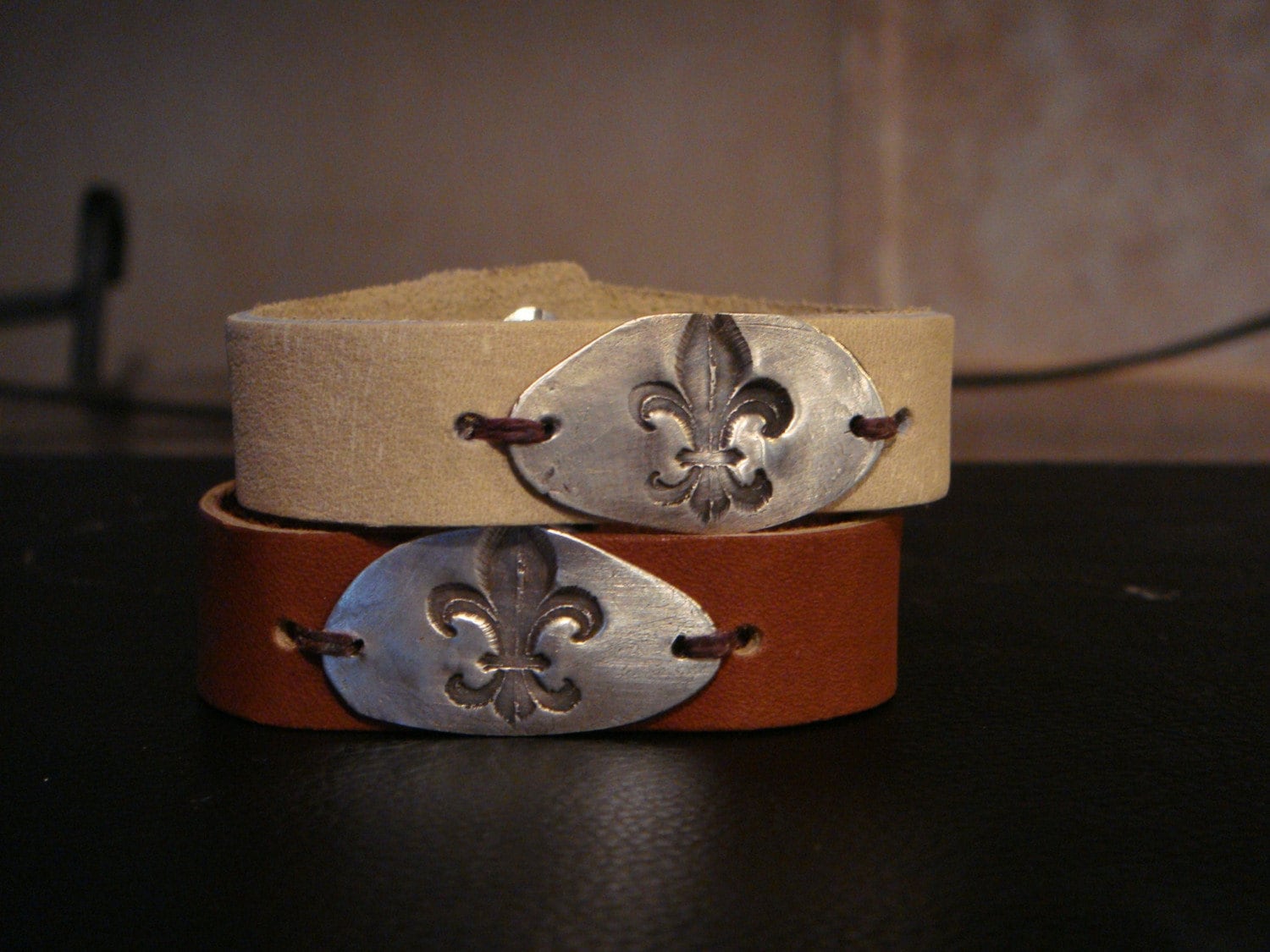
Fleur de lis jewelry
Every time I see her, she is wearing something new that I wanna rip right off her neck.
That's a compliment, people. If I wanna act on my covetousness and steal, you can rest assured the item in question is worth the sin and crime.
(To put in perspective, I wouldn't drive across the street to nab a truckload of free Thomas Kinkade glow-in-the-dark "art" pukery.)
Anywho, take a look at the shiny bits of handcrafted coolness at V12's etsy site and order yourself a custom piece OR send the link to your honey for a gift idea.
Sunday, April 18, 2010
I am not a good example but a horrible warning
I did a bad thing.
Last week I posted about a few unfortunate decor trends in a typical Skitzo Leezra rant because, hey, it's a spin of the dominant personality wheel here. One day - praise. The next day - shame.
However comma I took it way too far by posting photos that weren't mine but wait, there's more.
And let this be a lesson to you . . .
Ugh, it's baaaaad.
Last night, a bit tipsy* after attending a really fun shindig, I logged on to check out my Google reader and spied yet another not favorite craft project AND ~~~ I posted a negative comment directly to the blog chick! WITH MY NAME!
Horrible, right?
One of the nicer Skitzo Leezra personalities thought about it this morning but didn't immediately attempt to delete the message and, you guessed it, the blog chick victim already read it and was so upset that she blogged about my hateful comment.
AND, to make it even worse, she didn't call me out by name so not only do I feel like an asshole, I know I am an asshole.
While I'd like to think that we can critique ourselves and have an open discussion about things we dig and things we don't dig, my action were over the top.
Shame on me.
The good thing? She is getting lots of positive feedback from her followers about idiots like me and I am experiencing a learning moment.
Working on my apology,
I am,
Skitzo Leezra Studio
*I hate when folks blame their bad behavior on drinking. The original blog entry was bad while sober but the direct comment would not have occurred while sober. Instead, I would've just rolled my eyes and scrolled down.
Saturday, April 17, 2010
Check out the whatnot at Project Parsonage
She calls herself a lazy Martha and this chick creates an "illusion of permanence" since she and her husband move often. She shows her tricks to selecting pieces of furniture for multi-functions and demonstrates the power of paint on her new blog Project Parsonage.
A little shabby, a little refined = after visiting her home, I am always inspired to enhance my own.
Friday, April 16, 2010
Fashion Friday
Makes me
wanna go rootin'
through the recycle bin,
I tell ya!
Thursday, April 15, 2010
Special Delivery Package
(Next time, I'll sew it closed instead of stapling.)
Rubber stamped my own "postage" stamps.
Wednesday, April 14, 2010
Burp cloth baby gift
Tuesday, April 13, 2010
It started with a hole
Saturday, April 10, 2010
A decor rant
I like interiors that reflect the owner with little clues about their passion or interest. Clues, I tell ya, not over-the-top advertisements.
When Sammy the cat came to live with me, also came feline themed gifts. If there is anything I've learned, it is this: cut off the unintended collections that one or two items might infer. Hey, I have a cat so why hell do I need to decorate my house with cat motifs? The real thing is enough.
Conversely, if you have children/motorcycle/sports interest, it is NOT a clue to a decor theme.
I've seen enough of the blog world's amateur attempts at home decor and the narcissism it illustrates. How many family photos is too many?
Seen far too many "Family Rules" plaques ~~~~(image deleted)
Thinking it is a byproduct of the crazed mommy scrap bookers running out of paper and considering their house an extension of the endless photos of the same kid, in the same pose, in the same outfit. Andy Warhol they are not. He understood repetition. Everyone else should step away. And Ann Geddes created enough havoc on her own, really, no needs to emulate her brand of cutesy puke.
And if I see one more shitty-assed burlap wreath, I'm gonna douse it with kerosene.
(image deleted)
Call it a hate crime because it is established that I hate all manner of cutesy and have kept my mouth shut for far too long.
Hey lady, your wreath is on fire.
Do you use a reader?
Friday, April 9, 2010
Fashion Friday
I picked up a couple things, in LONDON, THIRTY YEARS ago so let's just get that little nasty bit of snobbery out of the way. Sigh.
Oh, crap, forgot take photo of my English souvenirs. Karma getting me back for my arrogance.
My buddy Ernest was on a Paul Smith kick several years ago. Y'know, this look that was copied over and over again?
One day I see Ernest when what did I spy with my little eye but a pretty floral necktie.
I asked "who" he was wearing. Paul Smith.
It doesn't look like Paul Smith,
I say, as if I know more about men's fashion than Ernest, who attends fabric and fashion shows in Europe and is a buyer for a major luxury department store corporation.
It reminds me of Liberty of London, I tell him.
He patiently tells me that it is Liberty of London fabric but designed by Paul Smith.
Anywho, last week I went to Target for something else but couldn't help but to be impressed with the Liberty of London offerings. I mean, the coordination of merchandise from clothing to stationery to office organizing bins was too tempting.
Trying to fight my t-shirt and tailored inner voice, I picked up a ruffled blouse. Ruffles? Yep. I don't even like the potato chips by that name. Last time I wore ruffles was on a Gunne Sax dress and I wasn't real happy about it then.
Alright, alright, here's the blouse. You're right, the pond scum green called to me.
Except that it was hung backwards.
I liked the simple ruffle look.
This is the front.
With a cute fabric covered button and keyhole opening.
Got it home and tried it. So not me. Too ruffle-y. Not loving the sleeveless look with ruffles. Fabric where I don't want it, no fabric where I do want it. HOWEVER, thinking of making a summer blouse with a touch of femininity and getting out of the t-shirt rut.
Returned the blouse and came home with these.